POSTNORD
CLIENT: Postnord
DATE: 2020
DESIGN STUDIO: Bold Scandinavia
3D ILLUSTRATIONS: Martin Klint (Bold)
PROJECT: Brand Identity
MY ROLE: Junior Motion Designer
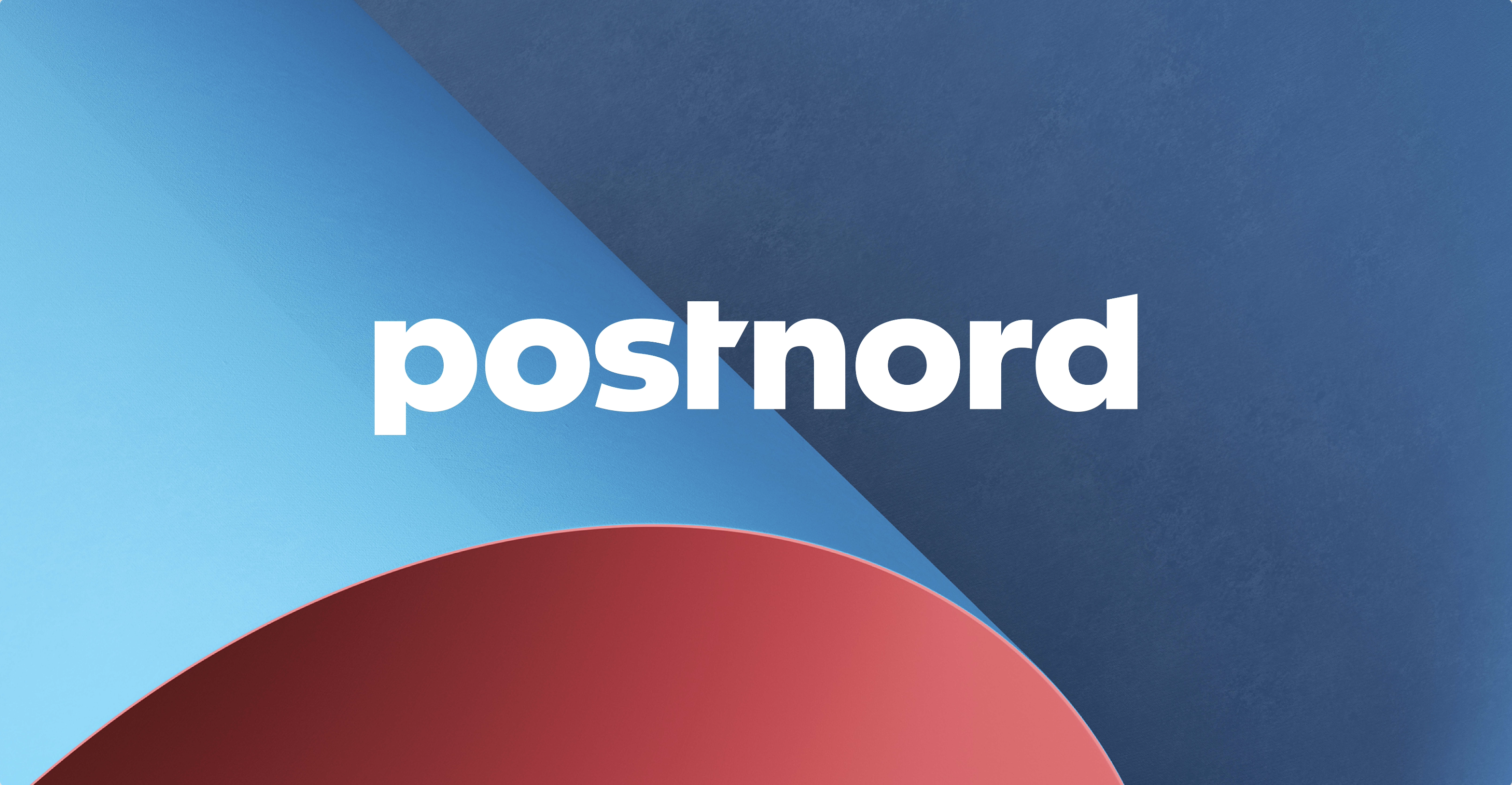
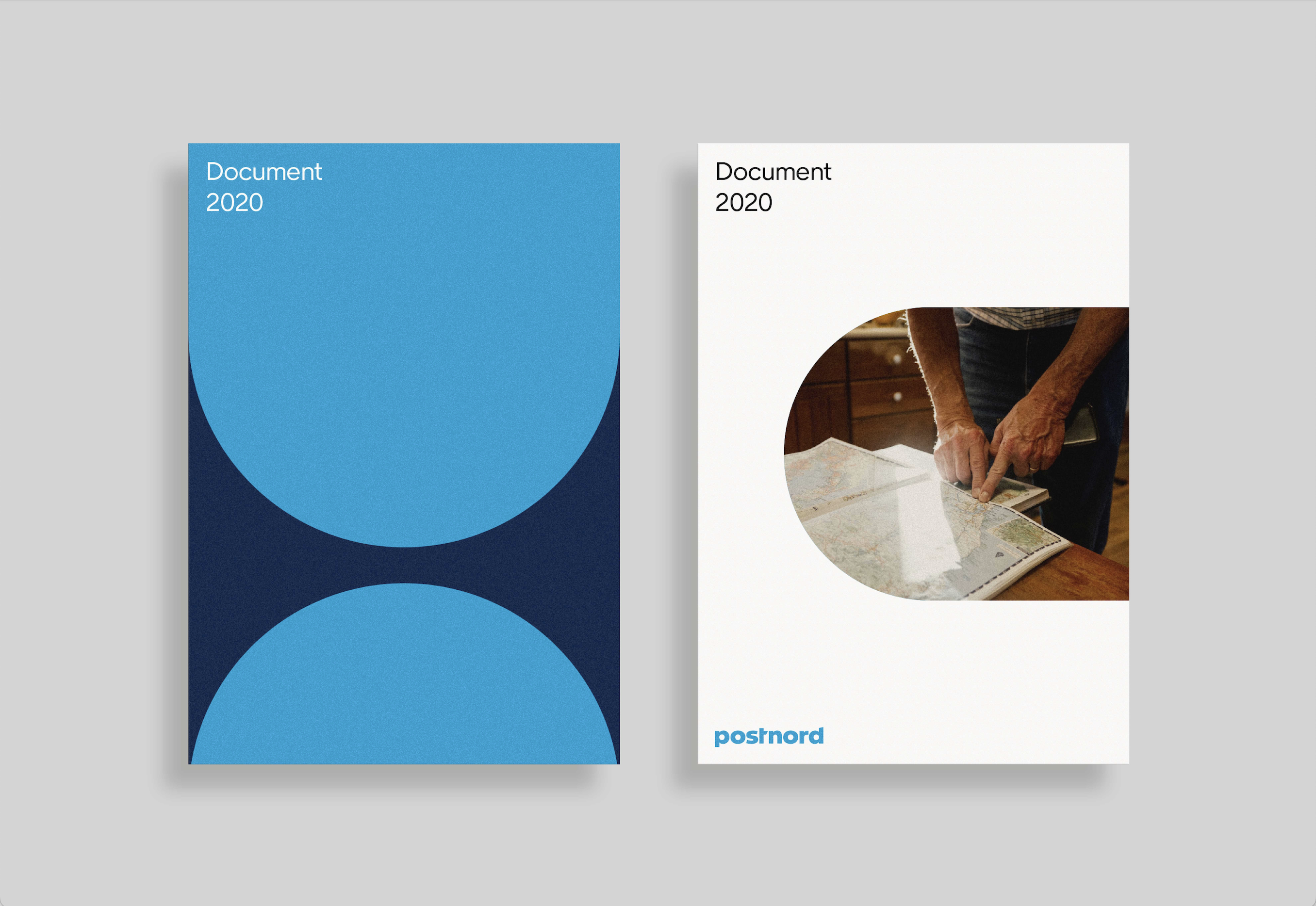
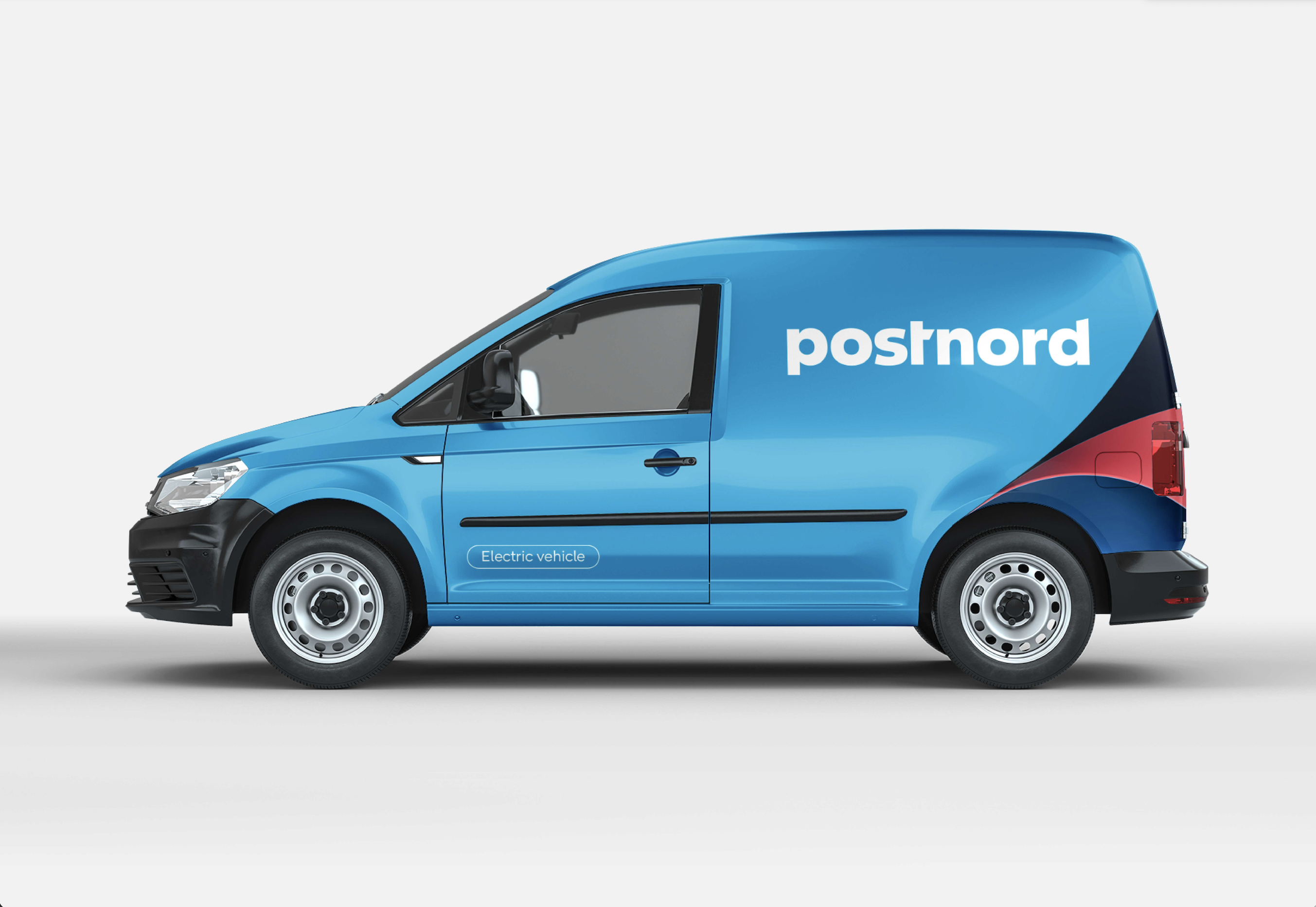
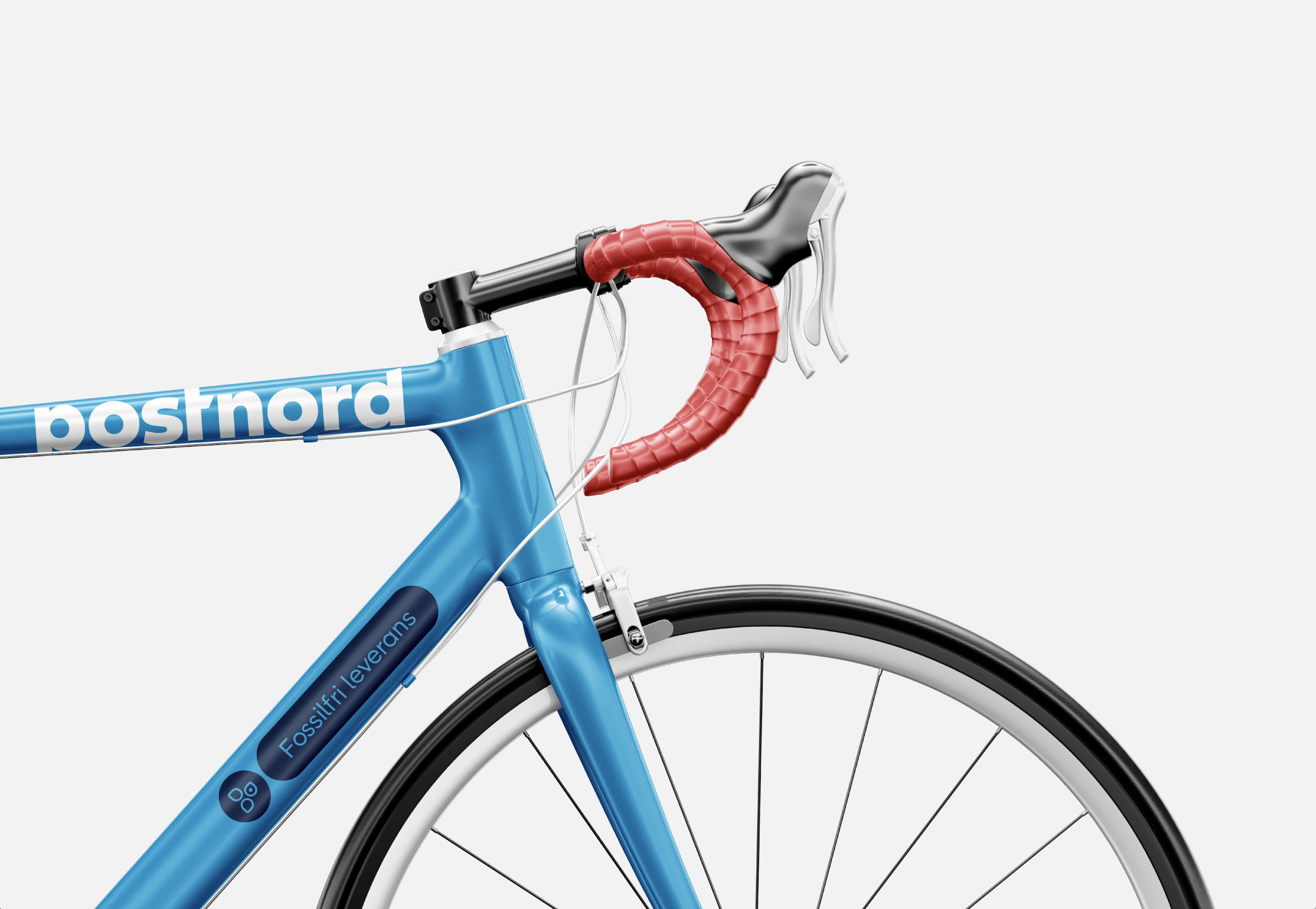
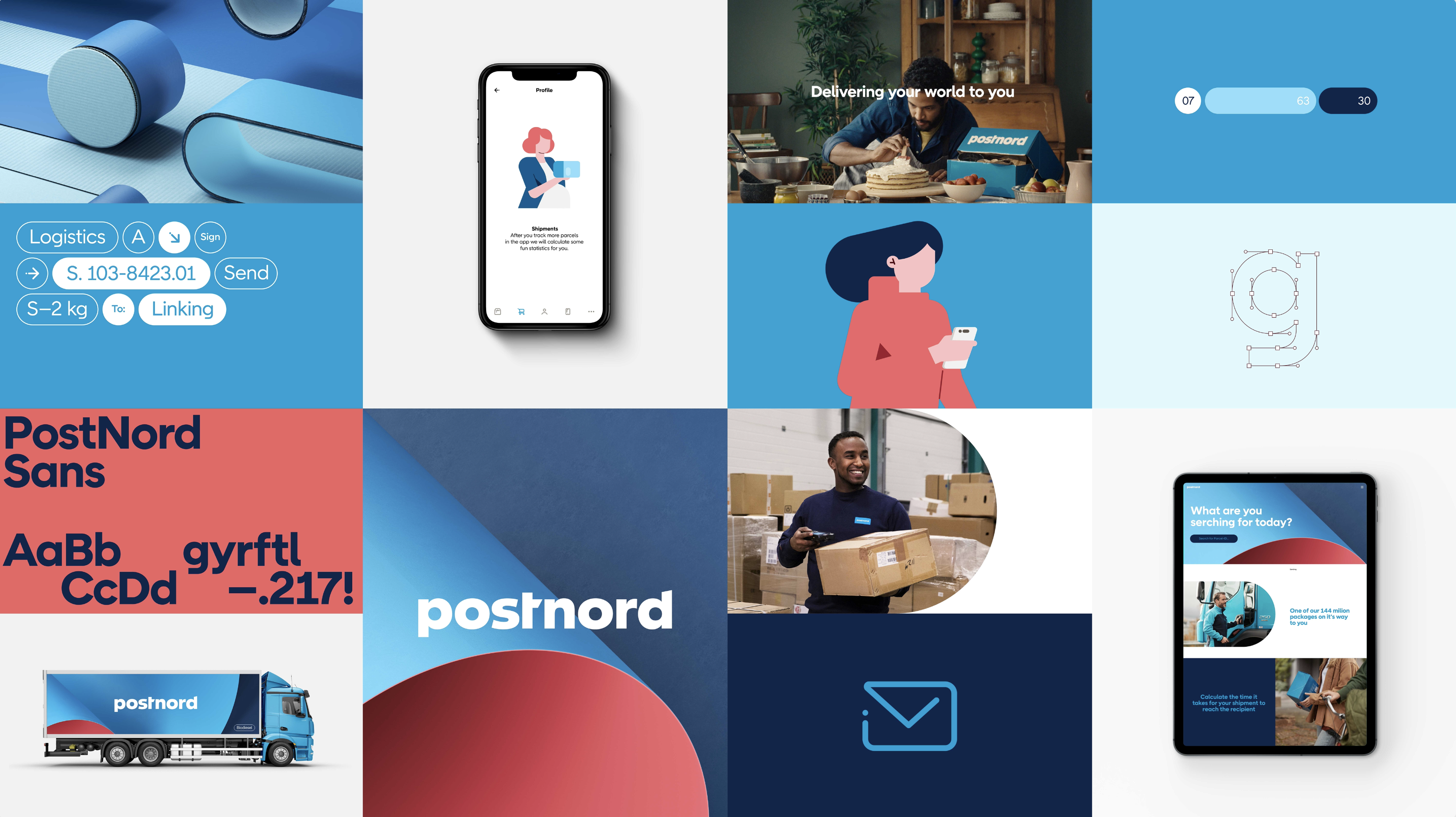
Bold made the new brand identity for PostNord, the leading supplier of communication and logistics solutions to, from, and within the Nordic region. At the heart of the identity is a dynamic new element we call “the link” — a simple yet adaptable graphic device that reflects PostNord’s role as the connection between sender and receiver. Developed around the existing PostNord wordmark, the link serves as a cohesive foundation for our new layout system, tailor-made typeface, illustration styles and more.
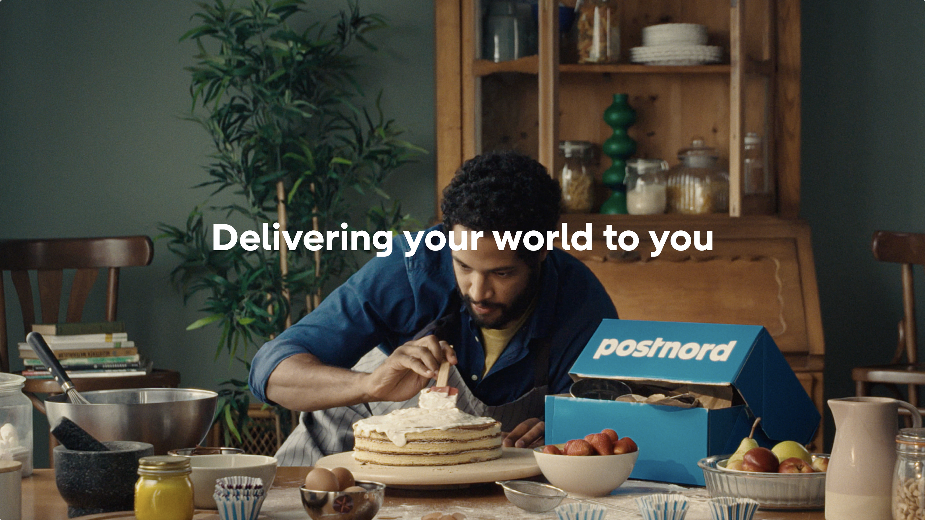
For a brand that’s constantly on the move in an increasingly digital landscape, the identity had to feel truly at home in motion. So, the link was brought to life through a set of dynamic motion principles and intuitive UI behaviors. A tactile set of hero illustrations were then developed around familiar shipping materials to link the digital expression back to the physical nature of the service and the joy of the unboxing experience.
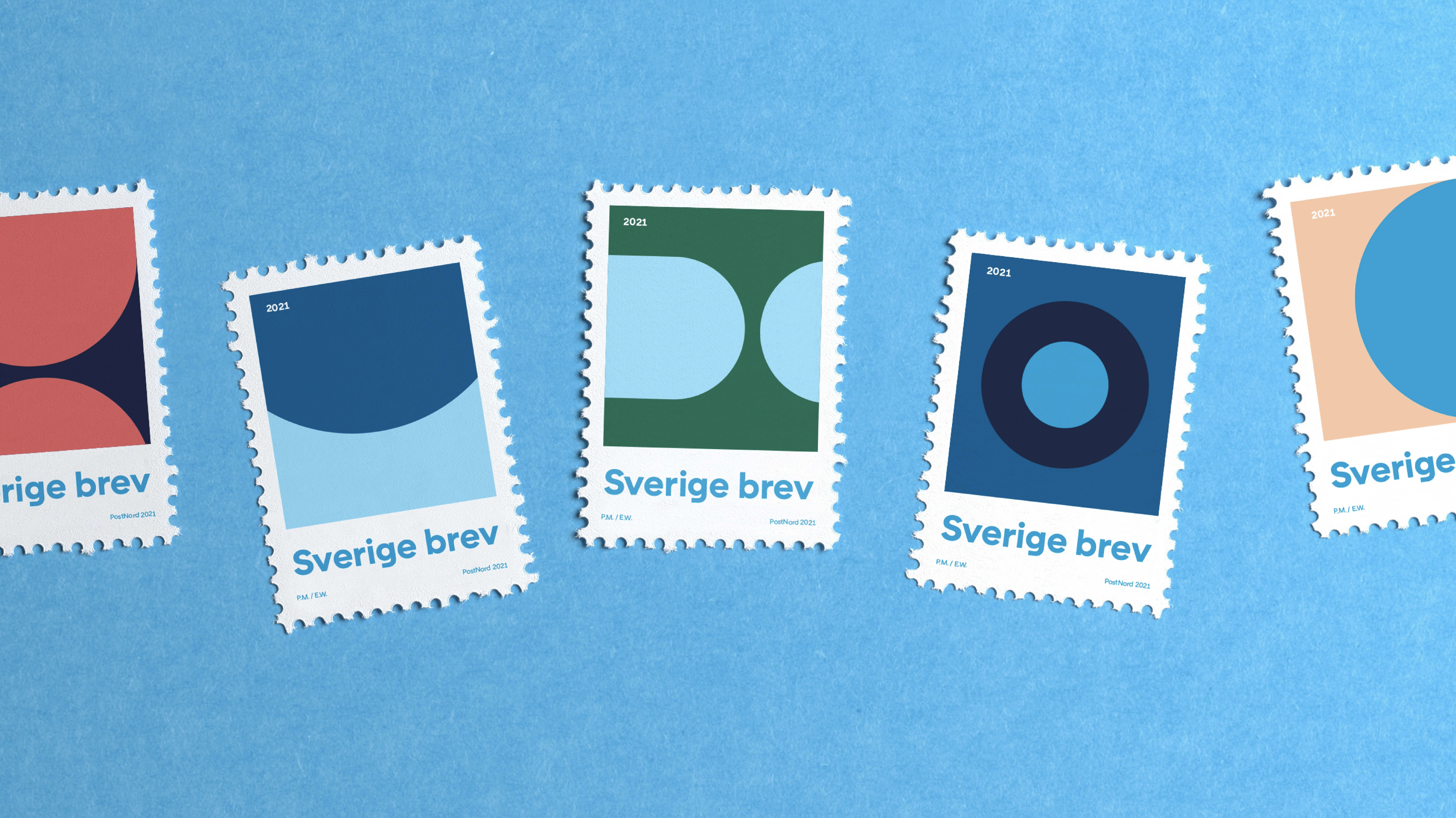
Finally, an expressive new cast of supporting colors were introduced to complement and enhance PostNord’s signature blue hue.
Some results since launch:
– Brand liking +72%
– Brand trust +71%
– Brand consideration +21%
– Sender id 92,6% (industry benchmark is 56%)
– Branded recall 56,4% (industry benchmark 27%)


HELLO@CHRISTINADAMSGAARD.COM